Information Architecture saved the app
At AirDev, I worked on Melon, an office catering platform. As the app grew, it became bloated with features before it was even released to users. I worked with the project manager to simplify the client and vendor user experience. The result was a cleaner, more navigable app structure with improved visual design. The customer was very happy with the outcome, and the project moved forward.
Company
AirDev
Timeline
1 month, 2023
Role
UX/UI design, Product strategy
Team
Auja Little
Challenge
As part of the app development team, I was responsible for creating initial designs for Melon. Over time, the Bubble designers and developers found themselves in a situation when the app became too cumbersome. Melon had:
four user types
a two-sided sidebar in the portal
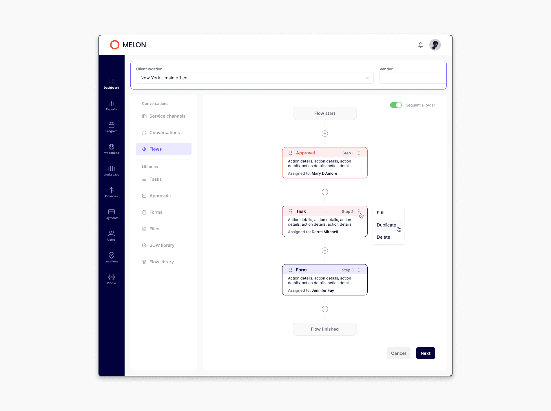
numerous excessive flows
new navigation items were still being added
These features didn't align with Melon's primary purpose of ordering and managing meals for office workers.

These issues made the user experience difficult and unpleasant, and Hick's Law explains why - too many options overwhelm users and slow down decision-making.
I proposed to the project manager to redesign Melon from the point of view of our main users, clients and vendors.
Solution
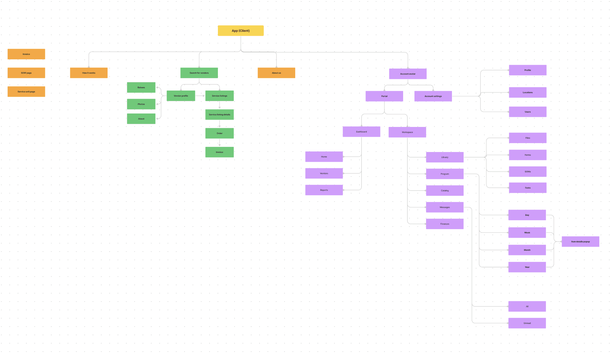
To simplify Melon, I created a detailed information architecture of the current app, its features, potral tabs, and flows. This comprehensive overview helped me identify the app's existing elements, allowing me to determine what needed reorganization and what could be removed.

[Initial Information Architecture diagram of the Client portal]
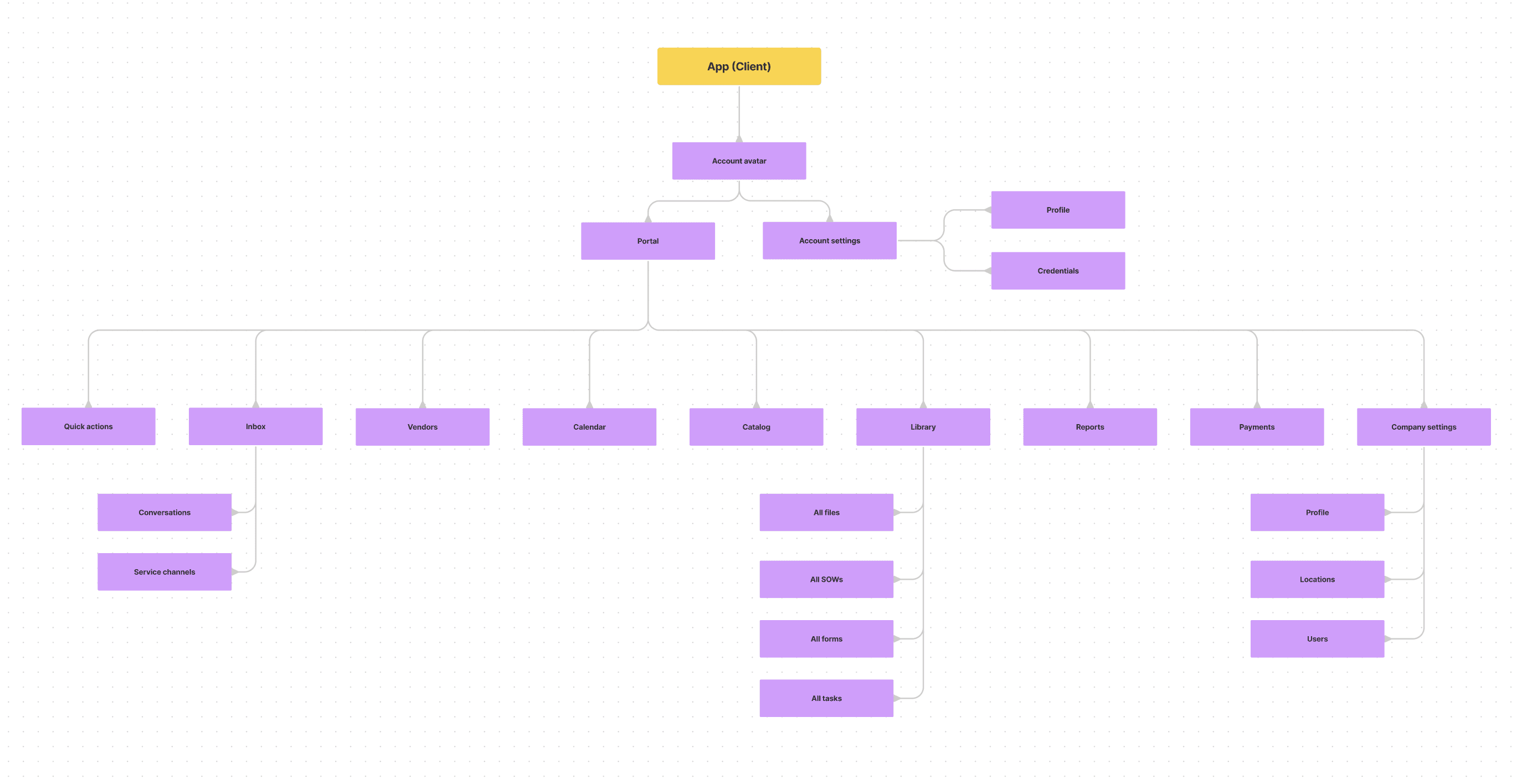
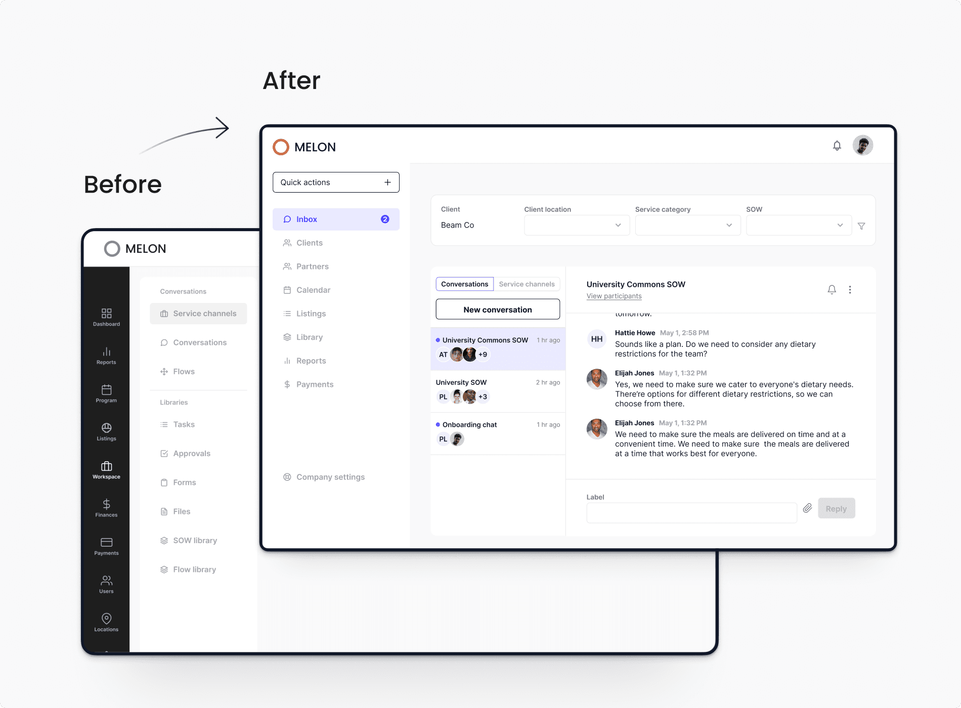
After a few iterations, Melon was streamlined to only two user types: client and vendor. Their portals had fewer, better-organized tabs. I removed irrelevant flows, focusing on the app's primary purpose - ordering and managing meals for office workers.

[Final Information Architecture diagram of the Client portal]
This simplification was guided by Tesler's Law, which acknowledges that some complexity is unavoidable but can be effectively managed. Users could now easily navigate the tabs to create listings, place orders, file reports, and find necessary files.
Outcomes
As a result of my work, Melon was simplified, reorganized, and focused on its main business goal. Bubble designers and developers successfully continued building and updating the app.
The customer was pleased with these results, and the app was successfully developed on Bubble.io.
I would also test our solution if I had more time and resources. I would run usability tests with our early users to learn:
if the app sidebar navigation was straightforward for both clients and vendors
how long would it take to create a new listing or task, file a report
what tasks completion rates would be
If we didn't have business budget constraints, user testing would be a part of project delivery.
[ I have omitted and obfuscated confidential information in this case study to comply with my non-disclosure agreement. All information in this case study is my own and does not necessarily reflect the views of AirDev ]
