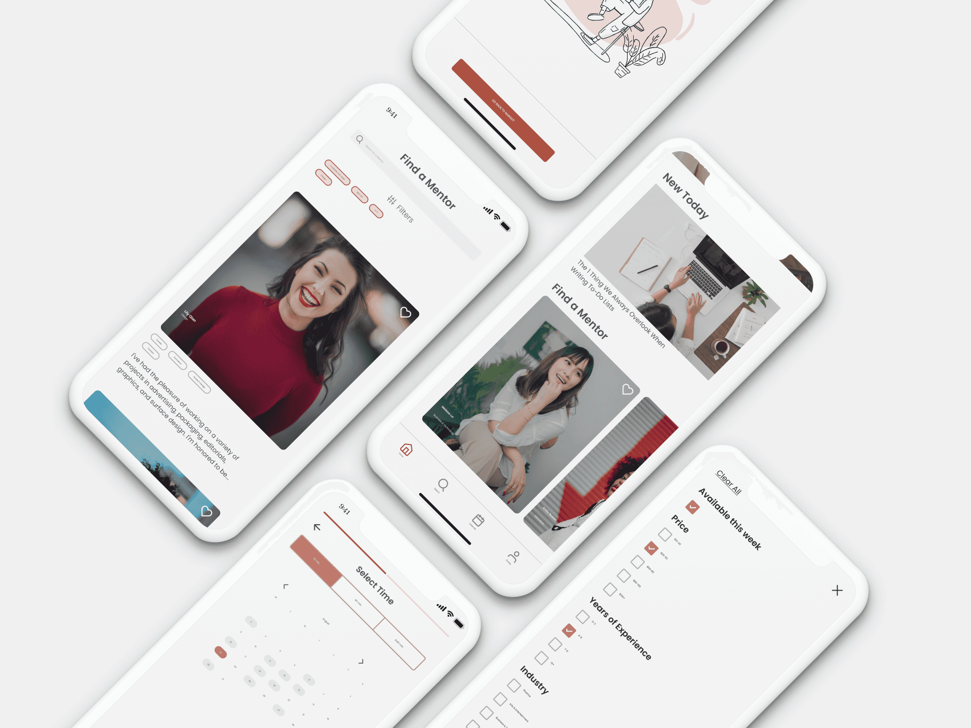
Improved booking experience for a mentorship platform
I reimagined the booking process for Margot Community, introducing a mobile app where mentees can easily find the right mentor, see their availability, and schedule a session. My design process included user research, wireframing, problem statements, user flows, prototyping, usability testing, and rapid iterations, which helped me deliver a better solution and improve the company's scheduling.
Company
Margot Community
Timeline
Six weeks
Role
User research, Product strategy, UX/UI, Design system, Prototyping, Usability testing
Year
2021
Context
I collaborated with Margot Community, an inclusive network for women and gender-marginalized individuals, to simplify scheduling time with mentors. Mentees found the booking system confusing and cumbersome, so I conducted user research and worked with the founders to streamline it. As a result, I significantly improved booking conversions and received good user feedback.
The problem: is this mentor available?
The main issue was that users couldn't easily view mentors' availability on the Margot site. They had to browse mentors' profiles and send them messages to check availability, which discouraged booking and negatively affected both mentors' success and the company's growth.
The current scheduling experience for booking a mentor uses a standard Shopify checkout flow with mentees selecting their session length and quantity, and then filling in personal details in a modal.
Saakshi Dhingra, Product Designer
From a business perspective, all bookings are handled by me, and the team would like to streamline this process with an easier scheduling and checkout flow. From a user perspective, this checkout flow is repetitive and requires users to schedule exact timings after they've checked out.
Joss Richard, Founder
How to fix it: hypothesis
We believe that by providing a visual schedule of mentors’ availability, we’ll make the booking process more transparent and efficient for users (user goal) and increase the number of booked sessions (business goal).
We believe that by adding brief information and primary skills to each mentor profile, we’ll make the booking process more transparent and efficient (user goal) and increase the number of booked sessions (business goal).
The solution: transparent booking
I conducted user research by asking participants to book a mentor session and note any pain points. The results showed that the experience was frustrating:
to find the right mentor, users had to navigate back and forth between pages
there was no information about mentors' availability
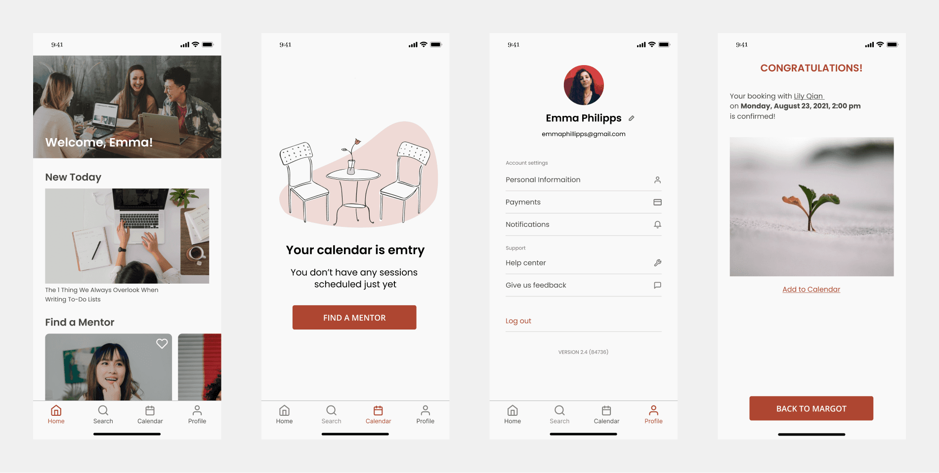
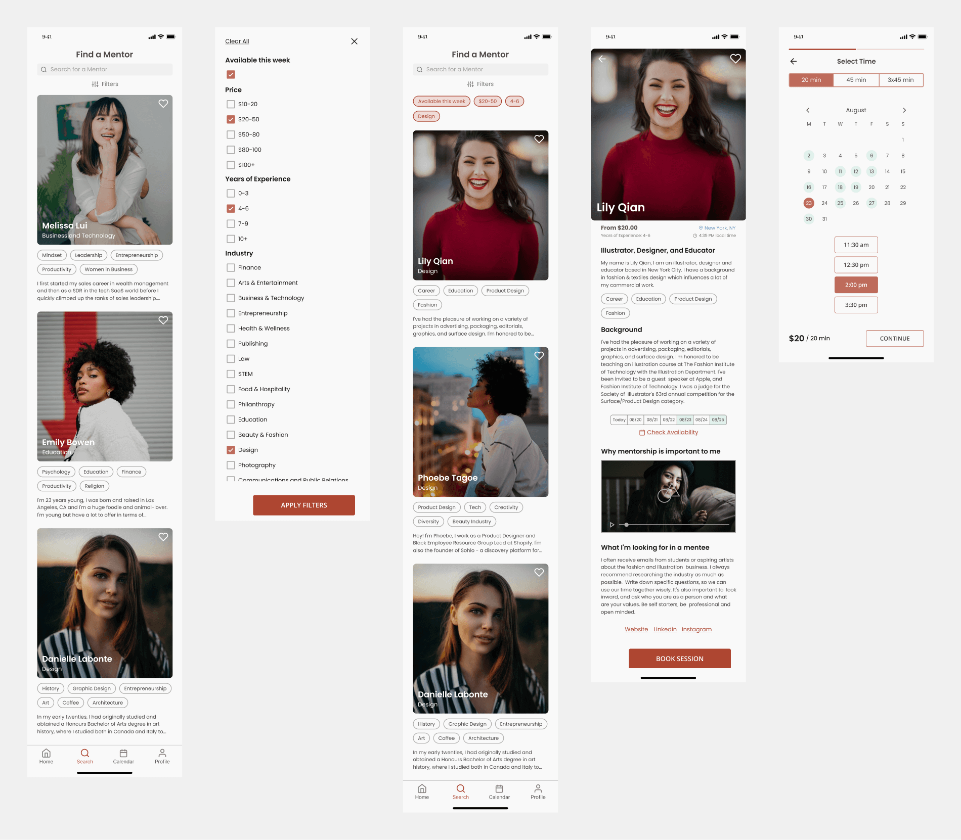
To solve these problems, I designed a mobile-focused booking process with a calendar, clear availability slots, and a confirmation page. Additionally, I improved the filtering system, added mentor details on the search page, and introduced profile videos, making it easier for users to find and book the right mentor.
Usability testing: does the solution work?
After creating a high-fidelity prototype, I tested it by asking users to use filters to find a mentor and book a session. I used Maze to run these tests and gather feedback.
I also wrote a blog post about this usability testing, sharing more details about the process and what I've learned.
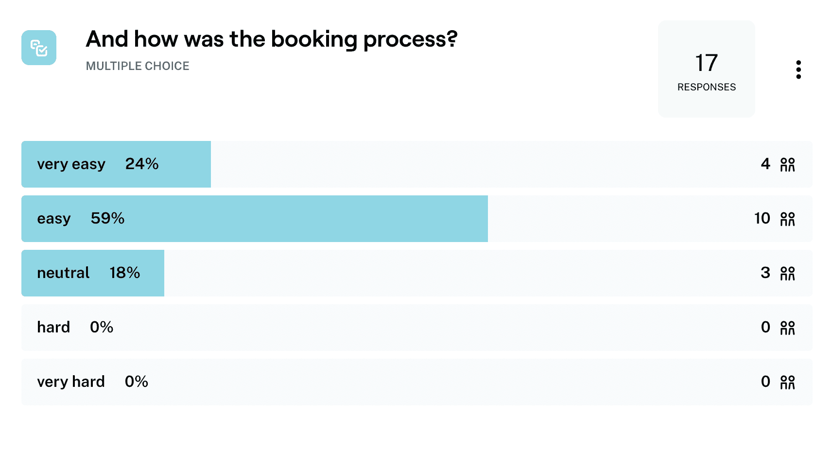
The outcome: the easy and transparent booking process

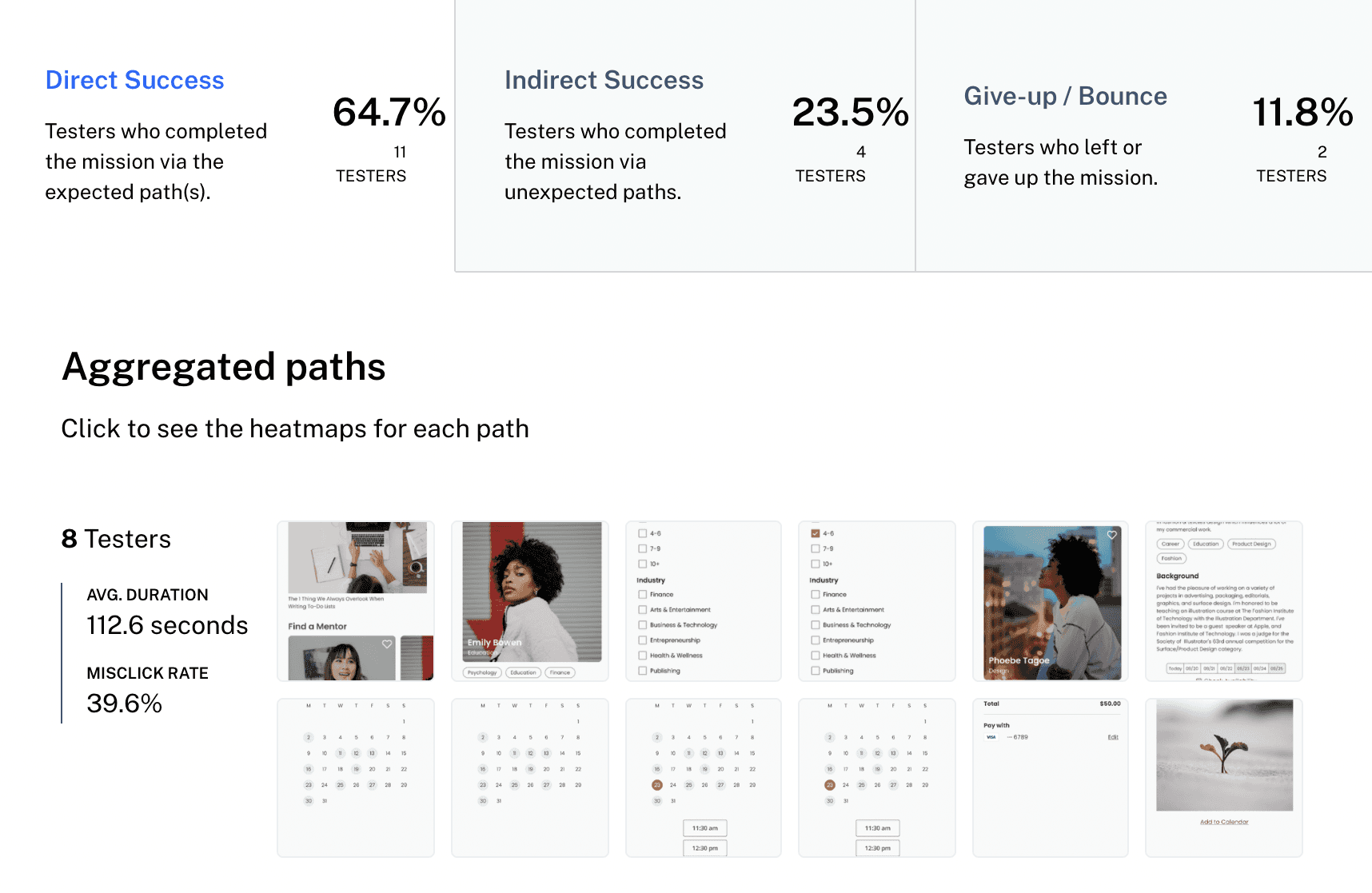
The unmoderated usability test results showed users found the redesigned booking process convenient and intuitive. There were also many misclicks because I tested a happy path for my design, but the completion rate indicated a positive result.
Users' feedback on my open-ended questions gave me valuable insights for further improvements.
By making a scheduling experience more intuitive and clear, I introduced a solution to increase the number of bookings, which benefited mentees, mentors, and the company.
High-fidelity prototype, updated after the usability testing:
